UFC 3-120-01
FEBRUARY 6 2003
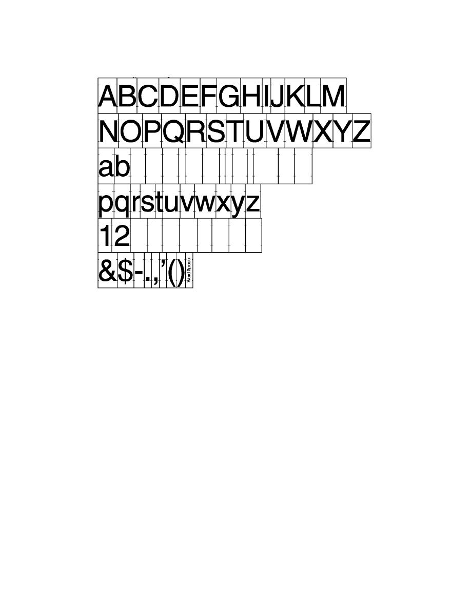
Figure 2.2. Helvetica Regular Tile System.
2.6. Letter Spacing Standards. Tile systems are easy to obtain, but there may be times when tiles
are not available. In those situations, use the letter spacing specifications given here for both the
Helvetica medium and the Helvetica regular typefaces. Letter spacing is based on a unit system in
which each unit is equivalent to 1/50th of the capital letter height. Table 2.1 shows the numbers of
spacing units required between characters. Use 20 units between words and 6 units before a
punctuation mark such as a comma, period, semi colon, colon, parentheses, apostrophe, or dash. , . ; :
( )' -. No units are used before or after a diagonal slash (/). An example of correct letter spacing is
seen in Figure 2.3.
their proper placement in relation to letters. The dimensions of the arrow tile and letter spacing are
based on the system described in paragraph 2.6, where one unit is 1/50th the height of a capital letter.
Use the standard arrow tile for the Type G3 Pedestrian Information sign and all interior directional
signs. Use the standard Manual on Uniform Traffic Control Devices arrow on all traffic and
directional signs.
2.8. Tile System Application. Air Force signs are laid out by arranging letter and spacing tiles on a
layout grid drawn on the sign face. (A dimensioned layout for each type of sign is given in Chapters
3 through 10.). Tiles are applied to the sign by placing them next to each other and lining up the
alignment notches with the layout lines drawn on the sign face. The sizes of the different signs in the
system are based on multiples of the capital letter height (cap height) of the alphabet to be used in
each sign. All of the layout elements relate to the capital letter height. (See Figure 2.6.) The
maximum tile count given in Figure 2.7 and on the sign layouts in the following chapters indicates
22


 Previous Page
