UFC 3-120-01
FEBRUARY 6 2003
ADA compliance.
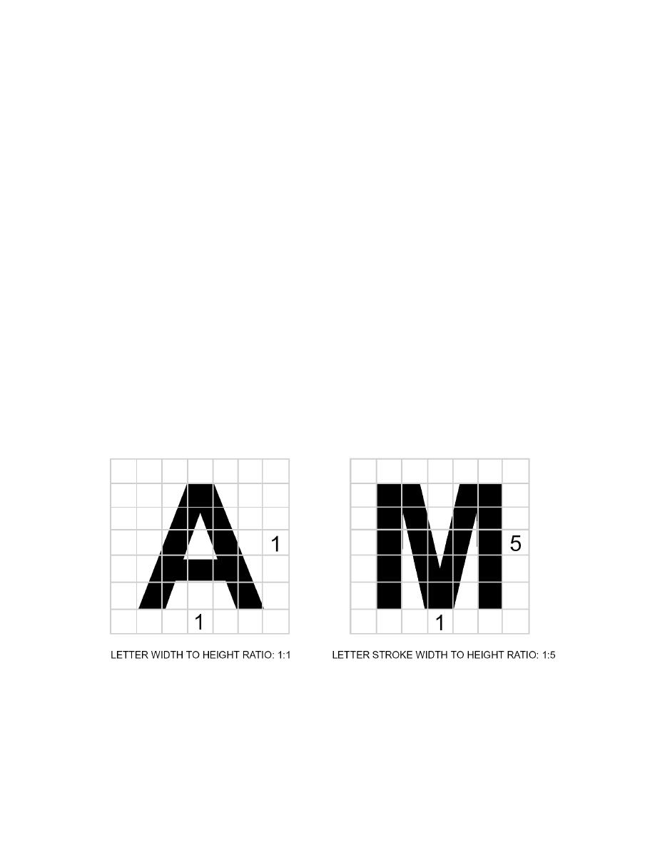
3.9. Width to Height Ratio. The acceptable range of width to height ratios for letters and numbers
on signs is from 1:1 to 3:5. That is, letters can vary from having the width equal to the height (1:1) to
having 3 units of width for every 5 units of height. Text that uses the 3:5 ratio is closer in appearance
to standard text.
3.10. Range of Stroke. The acceptable range of stroke width to height is from 1:5 to 1:10.
3.11. Character Height. Text on signs is sized according to the distance from which it is to be read.
The minimum height required is measured using an upper case `X'. Signs suspended or projected
overhead for an accessible route are mounted with their bottoms a minimum of 2 000 mm (80")
above the finished floor. Letters on these signs have a minimum height of 75 mm (3").
3.12. Raised and Brailled Characters. Raised and Brailled characters and symbols are only
required on signs that designate permanent rooms or spaces, including restrooms and room numbers.
They are not required for informational or way-finding signs. Raised letters and numerals on signs
must protrude a minimum of 0.8 mm (1/32") from the surface of the sign. All letterforms must be all
upper case with typeface of san serif or simple serif. Character height must be between 16 mm (5/8")
and 50 mm (2"). Raised letters must be accompanied by Grade 2 Braille. Pictograms must have a
minimum clear border of 150 mm (6") and must be accompanied by a verbal description directly
below the pictogram.
Figure 3.1. Width to Height Ratio.
3.13. Finish and Contrast with Background. Finish and contrast are an important factor in
legibility. Both the characters and background of ADA compliant signs must have a matte, eggshell,
or other non-glare finish. An eggshell finish is defined as 11 to 19 degrees of gloss on a 60 degree
glossimeter. Characters and symbols must contrast with the sign background; that is, light characters
must be on a dark background and dark characters must be on a light background. Light characters
on a dark background are generally considered to provide the greater readability.
64


 Previous Page
